Colour, Identity, and Light in Myanmar Fashion Photography
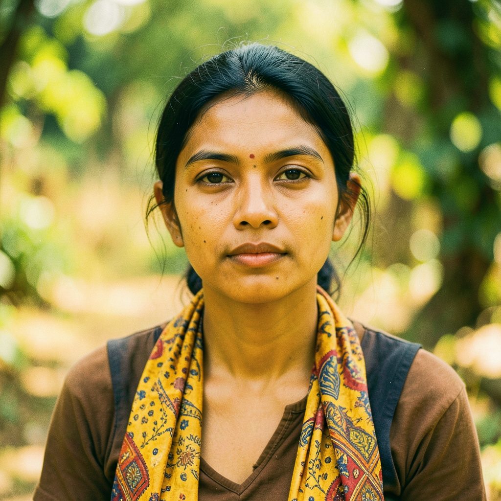
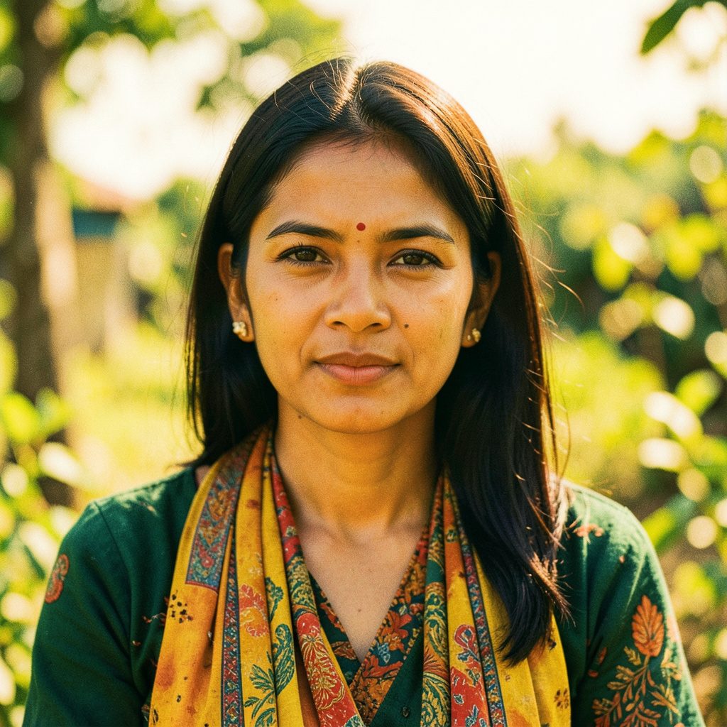
Colour gives a fashion photograph its first emotional signal. Before viewers study a pose, garment, or facial expression, they register whether the image feels calm, festive, dramatic, intimate, or modern. In Myanmar fashion photography, colour also carries cultural associations through longyi patterns, silk textures, jewellery, temple architecture, and the soft warmth of local light.
For Australian viewers, these visual codes create a rich point of comparison with familiar editorial traditions in Sydney, Melbourne, Brisbane, and beyond. A Myanmar portrait gallery can feel vivid without being loud, while a restrained fashion cover may communicate status through subtle colour relationships. The strongest images treat colour as part of the subject’s identity rather than a decorative filter placed over it.
Colour as a Cultural Language
Myanmar clothing often provides a natural colour structure for the photograph. A model wearing a deep red htamein, a jade blouse, or a gold-accented traditional outfit already brings visual meaning into the frame. The photographer’s task is to support those tones with a background, light source, and composition that give the clothing room to speak.
Colour symbolism also changes according to context. Gold may suggest ceremony, prosperity, or radiance, while white can create a sense of purity and simplicity. Rich indigo, emerald, maroon, and saffron can connect an editorial image to regional craft traditions without making the photograph look historical. The balance depends on styling, setting, and the model’s expression.
This is useful for editorial archives such as Myanmar-model.net, where magazine covers, fashion shoots, and portrait collections can be viewed together. Across a series of images, recurring colours may reveal how a model’s public image develops from traditional elegance towards contemporary glamour.
Skin Tone, Fabric, and Natural Light
Colour rendering begins with accurate skin tones. Warm tropical sunlight can make skin appear golden, while shaded streets and indoor locations may introduce green or blue casts. A skilled photographer observes how these changes interact with makeup, hair colour, and fabric before deciding whether to correct or preserve them.
Textiles add another layer. Silk reflects highlights in a way that differs from cotton, satin, denim, or handwoven fabric. A brightly coloured longyi can lose its pattern when photographed under hard frontal flash, while side lighting can reveal its weave and create depth. Neutral clothing may benefit from a stronger background, whereas a vivid garment usually needs a quieter setting.
Australian audiences are familiar with the challenges of intense daylight, especially during outdoor shoots in Perth or Brisbane. Midday sun can flatten facial features and push bright colours towards clipping. Open shade, a large diffuser, or late-afternoon light often preserves the difference between warm skin, coloured cloth, and a pale background.
Posing and Colour Relationships
A pose changes how colour moves through an image. A model turning the shoulders can make a patterned sleeve lead the eye diagonally across the frame. Raised hands may bring jewellery or painted nails closer to the face, linking small accents with the dominant tones of the outfit. Sitting poses create broader blocks of colour, which can work well for magazine layouts.
Expression matters as much as posture. A saturated red dress paired with a direct gaze creates a different impression from the same dress worn with a relaxed, downward-looking pose. Photographers exploring this relationship can find useful visual context in posing advice from Chit Su, where body position and expression are treated as connected elements of the portrait.
Colour can also guide the viewer towards the face. A complementary background may increase contrast, while a closely related hue creates a softer, more unified image. These choices are especially important in close-up celebrity portraits, where there are fewer objects in the frame to balance a strong lipstick, earring, or neckline.
Palette Choices Across Editorial Styles
Different photographic purposes call for different degrees of colour intensity. A beauty portrait may rely on gentle skin tones and one carefully chosen accent, while a fashion campaign may use several contrasting colours to create energy. Traditional clothing shoots can sit between the two, combining ornate garments with calm architectural surroundings.
| Editorial style | Useful colour approach | Visual effect |
|---|---|---|
| Beauty portrait | Soft neutrals with one accent | Focuses attention on skin and expression |
| Traditional clothing | Jewel tones with warm earth colours | Connects fabric, heritage, and setting |
| Magazine cover | Bold contrast and clean blocks of colour | Creates immediate recognition at small size |
| Street fashion | Mixed tones with natural background colour | Feels contemporary and spontaneous |
| Evening glamour | Deep shadows with metallic highlights | Suggests drama, luxury, and polish |
The Australian market often rewards images that remain readable on a phone screen. A cover viewed quickly through social media needs a clear dominant colour and a face that remains distinct against the background. At the same time, online viewers may spend longer with a full portrait gallery, allowing quieter combinations of beige, charcoal, cream, and muted blue to reveal their detail.
Melbourne’s fashion audience may respond to restrained, editorial palettes connected to independent design, while Sydney campaigns often accommodate polished commercial styling and strong coastal light. These are broad tendencies rather than fixed rules, yet they show why colour grading should consider where and how an image will be seen.
Backgrounds, Architecture, and Place
A background is an active colour partner. Painted walls, lacquered wood, greenery, market stalls, and urban concrete each produce a different visual temperature. In Myanmar photography, a warm architectural surface can echo the tones of a traditional garment, making the model appear embedded in the environment rather than placed in front of it.
The same principle applies when Myanmar fashion imagery is presented to an Australian audience. A portrait shown in a Sydney gallery, a Melbourne editorial spread, or an online collection viewed from Adelaide may be read through local expectations of colour and space. Keeping some environmental detail helps preserve cultural context, especially when the clothing carries regional or ceremonial significance.
Care is needed when using colour to signal “exotic” atmosphere. Excessive saturation can turn a genuine cultural setting into a visual stereotype. Authenticity is usually stronger when the photographer allows natural surfaces, ordinary shadows, and believable colour variation to remain visible.
Styling, Makeup, and Colour Grading
Makeup should support the palette rather than compete with it. A coral lip may connect with a patterned skirt, while bronze eyeshadow can echo gold embroidery. If every element uses a different intense hue, the face can lose priority. Coordinated colour families create a more considered result, even when the clothing itself is elaborate.
Post-production then refines the relationship between those elements. White balance, highlight recovery, selective saturation, and skin-tone adjustments can improve consistency across a collection. Overuse of clarity or orange-toned grading may make skin look artificial and flatten the subtleties of silk, lace, and woven patterns.
For photo archives, consistency has practical value. A series of images feels more professional when adjacent portraits share a believable tonal range. Individual photographs can retain their distinct mood, but repeated correction of skin, fabric, and background colours helps viewers recognise the collection as a coherent editorial record.
Building a Meaningful Colour Workflow
A reliable workflow starts before the camera is raised. The photographer can identify the dominant garment colour, choose a background that supports it, and decide whether the intended mood is ceremonial, playful, refined, or dramatic. A simple reference board of textiles, architecture, makeup, and lighting can prevent random styling decisions.
During the shoot, reviewing a few test frames helps reveal problems that are difficult to see in person. A red fabric may reflect onto the model’s skin, green foliage may create unwanted colour around the hair, and a white wall may become blue in open shade. Small changes to the model’s position or the light source can solve these issues more naturally than heavy editing.
The practical takeaway is to treat colour as a chain of connected decisions: garment, skin, pose, background, light, editing, and viewing platform. When those choices support one another, Myanmar fashion photography can preserve cultural detail while communicating clearly to audiences browsing an Australian magazine, gallery, or digital image archive.